Hollywood Sandwich Shoppe Menu
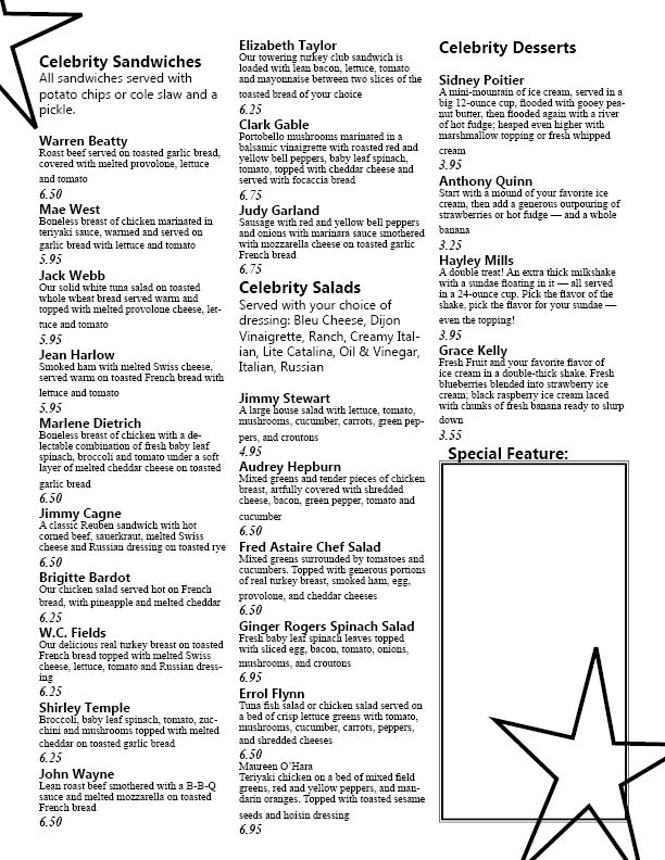
For this assignment I decided to try to go with the Hollywood theme. If I were given the freedom to use color, the graphics would have been more elaborate than they were. But in an effort to refrain from creating a look that would probably be too busy in black and white, I chose to keep the design simple. This menu had a lot of dishes that needed to be shown. I wanted to make it so that all of the food items fit onto the page without making the text look too small to read. I found that the best way to do this was to create a 3 column layout. The main headings I wanted to standout so I made all of them into a different font from the rest of the text and made them larger. Each dish was also given a different font and created to be slightly larger than the rest of the writing. And then the amount that each of the menu items cost was also created in a way that was meant to make it stand out so that it would be easy for the person reading it to see. I wasn't sure of just how much space that the Special Feature of the month would need so I made a lot of space just to be safe. Them to add the Hollywood theme I put two stars on the page. They are both falling off of the page but enough of the shape is showing to where the person reading can easily see what is meant to be seen. The front of the menu was fairly easy. I just went with the same font as I did for the headings on the inside for the address and I let the logo speak for itself for the most part. To make sure that the stars on the inside didn't just come out of no where, I also put a few of them on the font.